Ugi Stelmokaitis
portfolio website
About Project
2 Weeks / April, 2022 / Software Engineer Portfolio
Deliverables
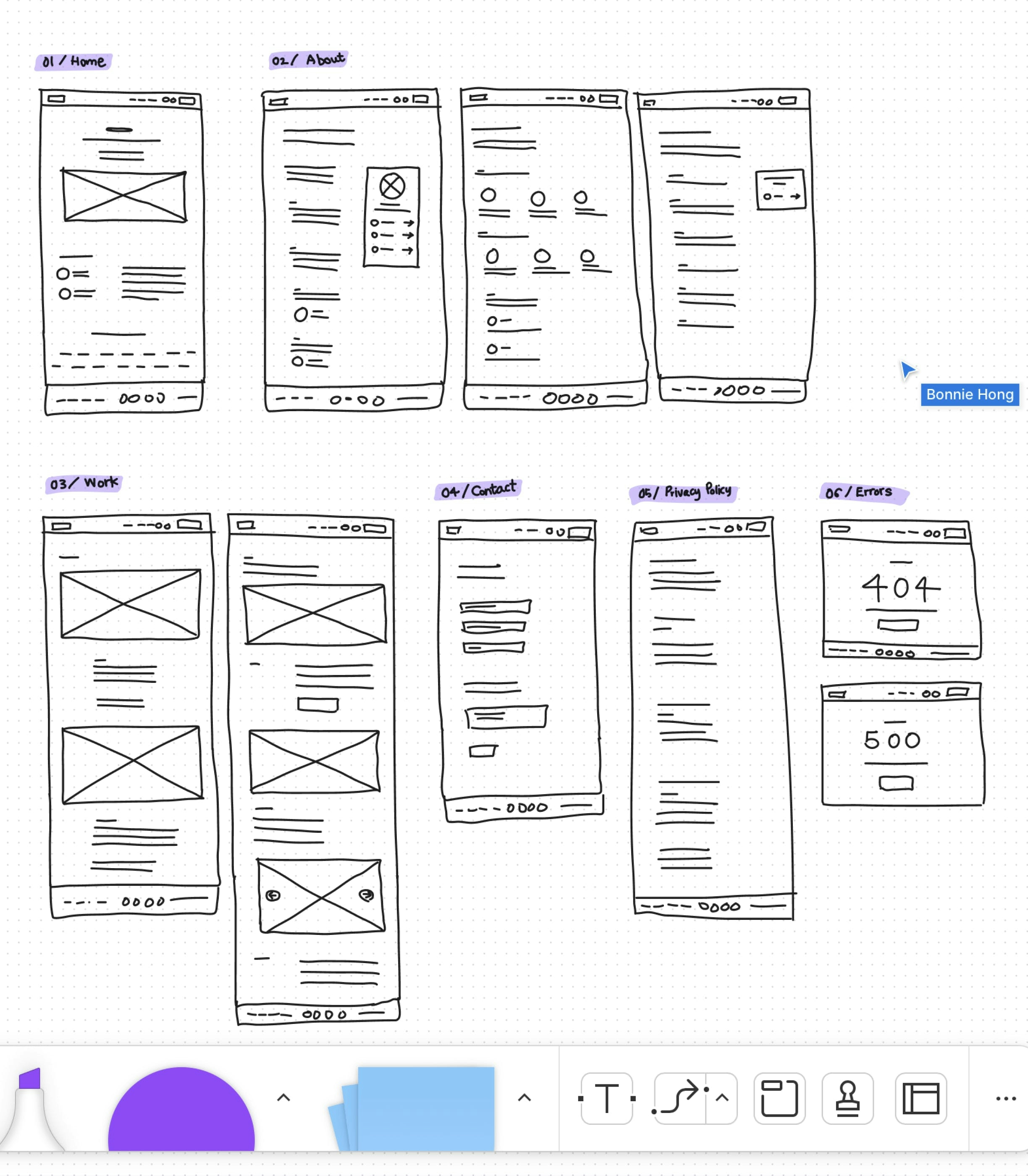
Wireframe, Design System, Dark & Light mode UI design
My Role
UX/UI, copywriting, iconography
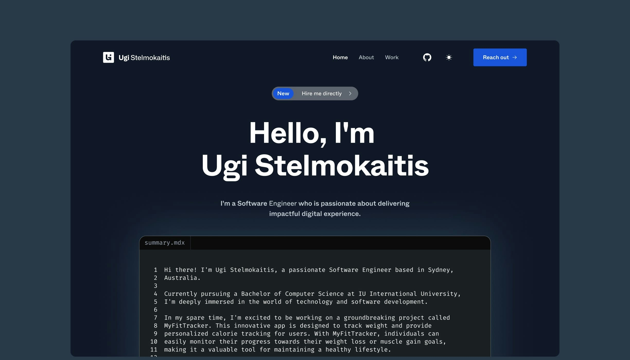
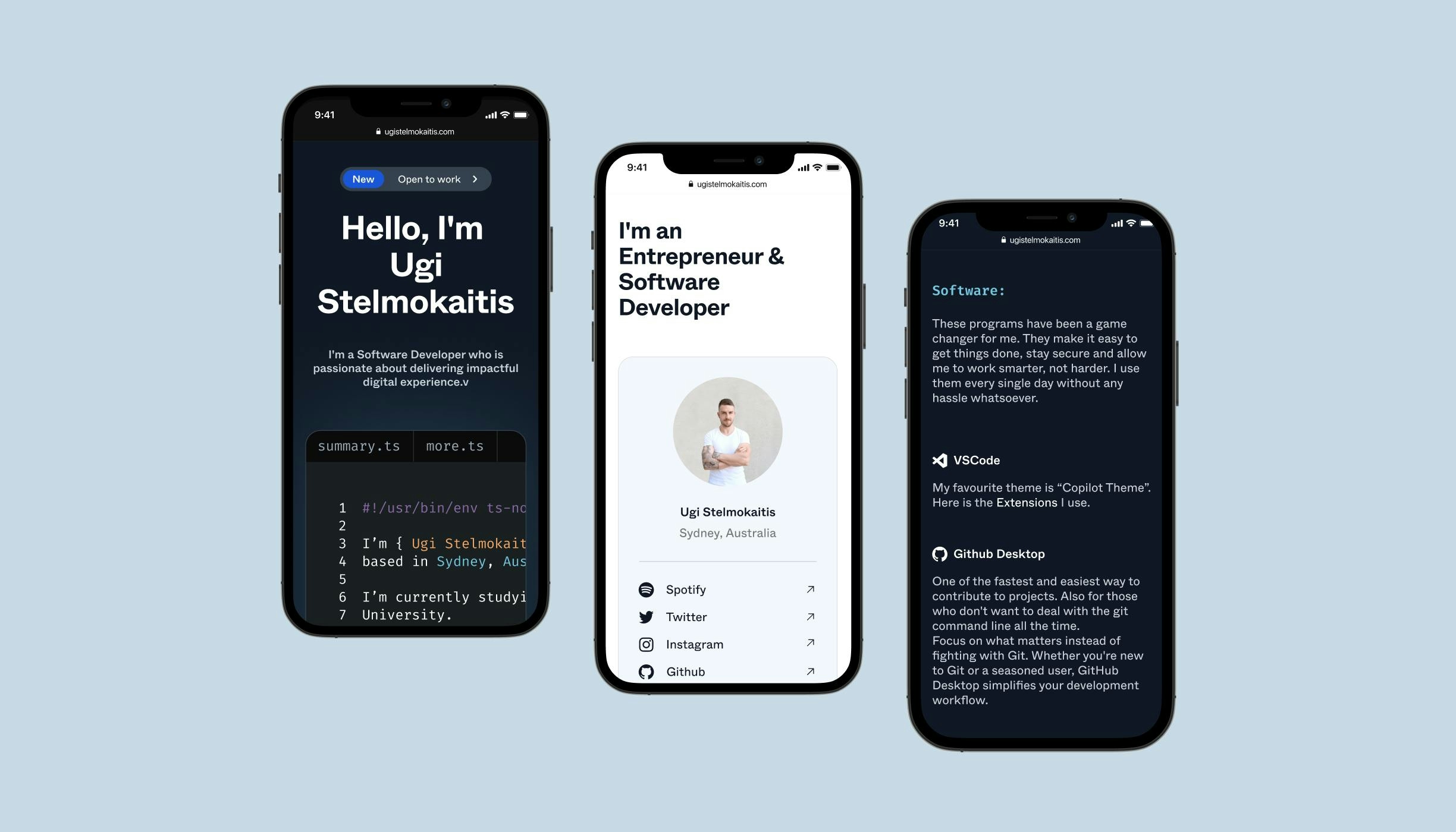
Ugi is a Software Engineer who is passionate about delivering impactful digital experience.
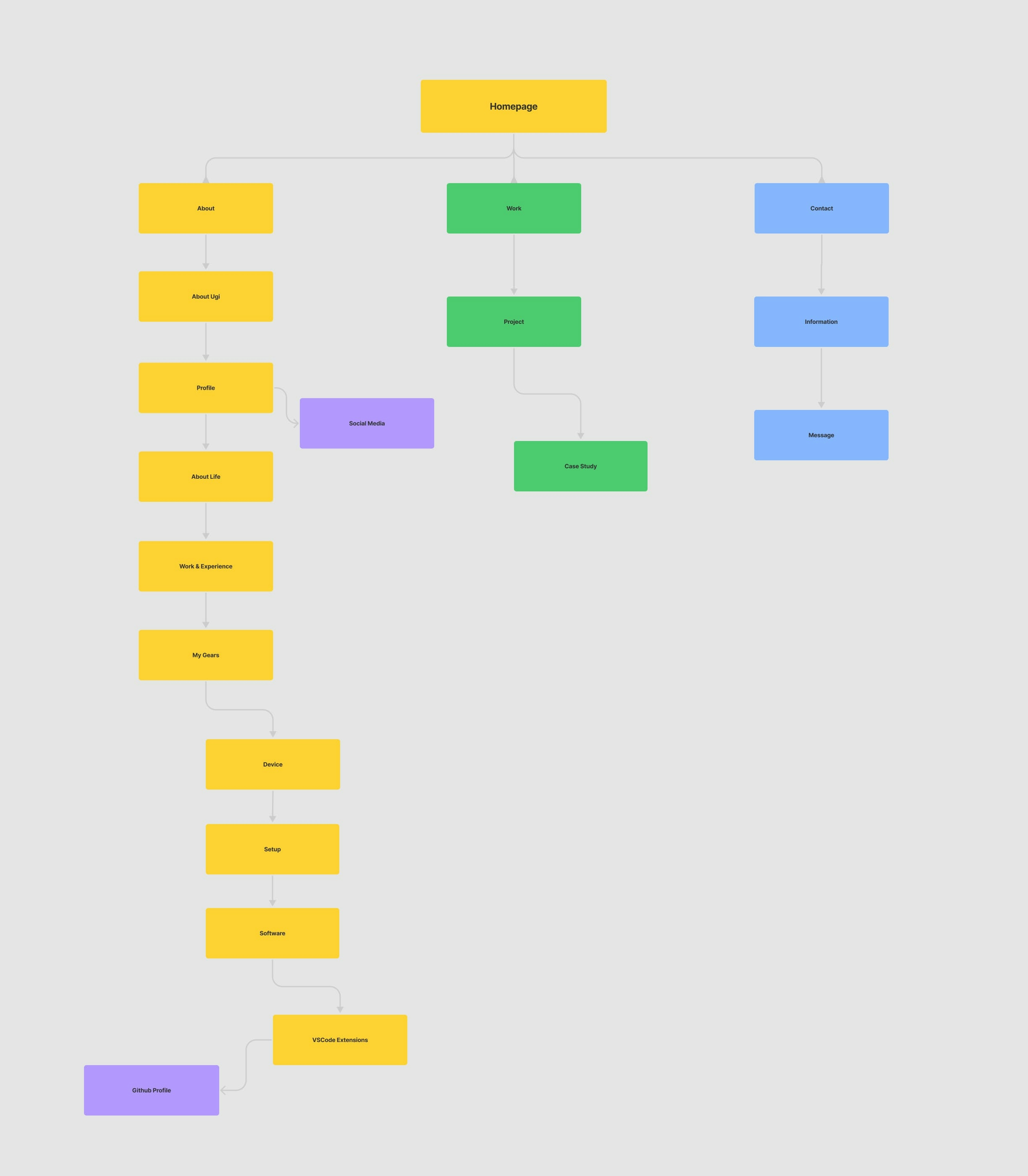
To promote himself and his skills to potential clients, Ugi needed a website for his portfolio. Ugi knew exactly what he wanted to deliver on his website, so I was able to create the site map and wireframe quickly and select the visual style we both loved by talking through the mood board.
Structuring the site
Ugi's portfolio website needed to be well structured in order to provide a lot of information, including an overview of himself, his expertise, the gears and the software tools he uses. It had to be very organized, legible, and entertaining so I focused on keeping the layout very simple. Instead, I introduced functions including Dark mode / Light mode and animations to the website to keep it exciting.
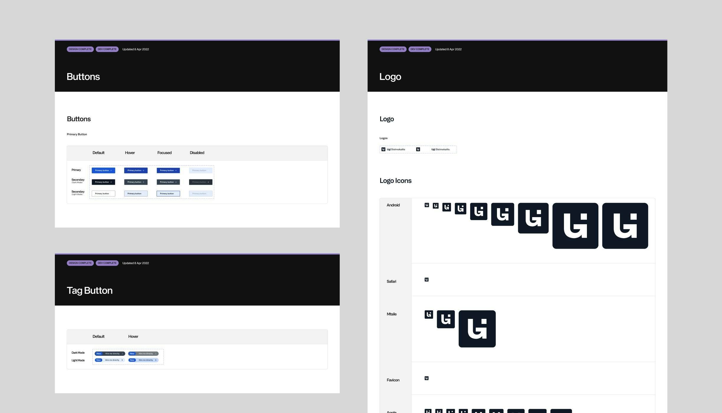
Design System
We really loved the concept of coding for the interface design, which made the site look very cool and very developer-like.
I went with two typefaces: Whyte for primary typeface and Fira Code for secondary typeface that was used for coding UI components and captions as it's well-known for coding typeface. I picked blue since it's often associated with technology and also because it looked fantastic on programming window, especially on dark mode theme.
Dark mode was perfect for this site as it completed the developer's look yet I wanted to design both dark and light modes because I wanted users to feel their preferences are valued.
Iconography
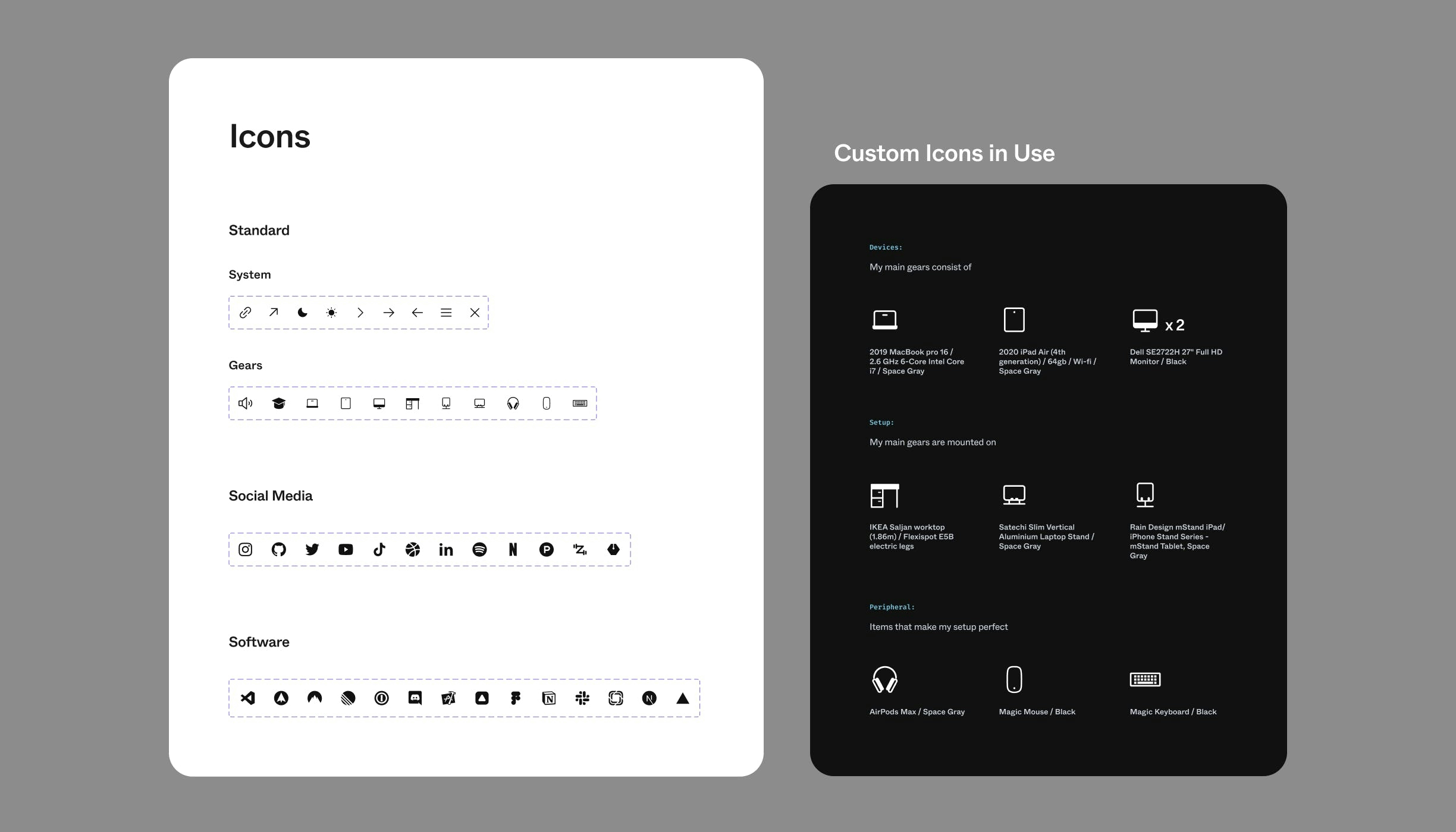
Ugi requested that I create a page on the site where he can share what equipment he uses for his day-to-day job, including devices, setup, and other relevant stuffs. To maintain a consistent appearance across the site, I created custom icons of electronic gadgets that were both realistic yet simplified.
Bespoke UI components
I designed Ugi's portfolio website as customized, distinctive, and one-of-a-kind as possible by creating bespoke UI components that set it apart from the competition. Even in the toast component, which maintains the overall site's appearance, there is plenty of attention to detail.
The toasts were designed to appear at the bottom right of the screen and provide users with quick, non-disruptive confirmations or alerts when they send a message on contact page.
I ensured that users can enjoy the same great experience on any device, whether they are at their desk or on the go.
